I'm FREE

I'm FREE
Showing posts with label floral painting. Show all posts

Monday, July 29, 2019

IT SEEMED LIKE A GOOD IDEA AT THE TIME - a step-by-step watercolour and some odds and sods

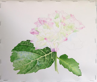
I thought, at the time, a botanical would be nice to do ...

... so I started working on a hydrangea.

Little did I appreciate what a stinker it would be to draw and paint! Mostly done wet-in-wet with some wet-on-dry with softening. Petals are quin. pink, cobalt blue, leaf green and phthalo. green. Leaves are leaf green, phthalo. green, quin. gold, quin. burnt orange and indanthrone.

Had fun doing the leaves though.

The blossoms just seem to be overwhelmed by the foliage. I thought of putting a loose greenish wash around the flowers, but I reached the point where I just wanted it done. No more nit-picking!


DONE
8.5 x 10.5 in.

Hmmm ... didn't realize this was sideways till it was on the page here, and I can't change it. However, it is just some fooling around, trying out techniques to create some credible-looking fog for a future painting.

From a recent class - we were painting birds, and I demonstrated some techniques to create different impressions of texture.

More playing with texture. I wanted  a faster, easier way to give the look of feathers. These above look much too contrived.

Pardon the vignette appearance - I was playing around with modes   in the photo-edit. It turned out that the wet-in-wet technique gave me the best results. It gave me a realistic impression of feathers without looking like I'd had my nose on the board painting each and every feather. This is not finished yet.

So I've been doing a bit of painting. But mostly I have been loving being able to MOVE again! It's been just over 11 weeks since my hip replacement, and I feel good. I can walk with the dogs for about an hour [hiking will come soon]. I am taking care of Bruno again - feeding, mucking out, grooming, and started lungeing him over the past week. I try to pace myself, as my endurance is still not fully recovered, but it's hard when I see all those weeds in the field needing to be removed, the electric fence needing re-wiring, eaves troughs ... neverending. But I love it - I feel alive again!!!

I appreciate your visit!

Tuesday, September 19, 2017

A BOTANICAL BREAK ...

I just had to get these clematis buds out of my system, and I wanted to paint something simple, austere. At this stage, I used mixes of aureolin and cobalt blue for the cooler greens, and quin. gold and phthalo green for the warmer ones, and floated them in to get a smooth look.

I continued with those greens, as well as some steaks of brown madder for the bud tips. The tiny bits of flower showing were done with a mix of cobalt blue and quin. pink.

The stems were painted with quin. gold and phthalo green, with quin. burnt orange and green glazed over later for the darks.

Created more depth with more applications of the same or darker colors.

Et voila - c'est fini!
Clematis Buds
28.5 x 40.5 cm. framable
$265.00 US
unframed


I was inspired to paint this after watching James Fox's documentary on the art of Japan.

Thank you so much for dropping by!!!

Thursday, January 26, 2017

Well ... THIS Is Going to Take a While!!! Latest Work in Progress

My Tracing. I really do prefer drawing free hand, but when the subject is this complex, and the details are necessary, I trace from my photo.

The subject

The colors. The pink hollyhocks, from my sister's garden, have beautiful shapes and shadows, but I thought I'd try doing them in yellow. The above photo is from my landlady's garden.

MANY glazes, starting with aureolin, then  gold with phthalo green, and several of  phthalo green and burnt orange for the darks.

Finally finished all the glazing yesterday, and am starting the subject.  I found I didn't get as much streaking from applying water to pre-wet before glazing by instead wetting gently with a spray bottle. So far, I am  using aureolin, and quin. pink with the blue shade of phthalo green for the shadows [weird combination though it seems] And I am staying with gold, burnt orange and phthalo green [yellow shade] for the greenery.
Once again, I leapt in without fully appreciating how difficult this would be. But we'll see what happens. I think I'll need to have a couple of "easier" paintings on the side to work on when I start going cross-eyed with all the detail on the hollyhocks.

Thank you so much for dropping by!

Sunday, August 31, 2014

"FANCY" is AVAILABLE for PURCHASE ...

 "FANCY"
13 x 8.5 in./
33 x 22 cm.
transparent watercolor on Winsor/Newton rag paper
$214.00 plus $20.00  shipping
I know I had mentioned that I painted this for a friend with whom I work. But when talking with her about a week ago, she said she would much rather I sell it, as she realizes I need the money. So here we are ... offering this beauty for sale.
If you have any questions, or a burning desire to have this painting, please leave me a note.

Tuesday, February 11, 2014

Having to Prove to Myself that I Can Still Paint ...

Reference - I am still fascinated with dried hydrangea.

I wanted to capture the shapes and translucent overlay of shadows.

My palette is cobalt blue, quin. gold and quin. pink.

I am fairly satisfied with the depth of color and shadow. Now I must decide whether I want to be really fussy, and include the veins in the flowers, and how to represent the shadow below the arrangement.

Suffice to say that it has been a rough couple of weeks. I haven't felt like painting much, and when I do, I don't like the result. So I thought to do something smaller, easier - simple and attractive to me. So far, so good - I LIKE it!

I appreciate your dropping by, and always welcome comments and critiques.
  

Monday, January 13, 2014

Hmmmmm ... This Is Going to Take Longer than I Thought ...

I have mapped out the shadows and colors for the blue parrot ...

... and have started the black parrot, to get an idea of how dark I must go ...

Ack!!! I don't know why this image has come out so light!
However, seeing the darks of the black parrot, I know I will have to get more intense with colors on the lighter, blue tulip.
I am painting both tulips using w/w washes, dropping in colors to the water. For the blue parrot tulip, I am painting with mixtures of aureolin [very little], quin. pink and cobalt blue. On the bottom shaded petal, I have glazed with alizarin crimson, then indanthrone blue. For the black tulip, I am using alizarin crimson, quin. violet, and a mixture of quin. burnt orange, quin. violet and indanthrone for the black. The stamen in the middle is aureolin, quin. burnt orange and indanthrone. My plan is to use the violet for the petals in direct light [cooler] and crimson in the richer, darker areas. The black parrot will need a lot of glazing, and I find I am having to use an extremely delicate touch when adding the pigments.
That's it for life in tulip land. I am still working on the tug boat painting, and will post the final result. Now it's off to the land of horse ...

Thank you for dropping by, and your comments are always welcome!


Tuesday, September 17, 2013

A Process on Fabriano Paper

Reference - one of my landlady's gorgeous roses

Sketch I did while working at the gallery on Sunday. It was a very slow day.

Yesterday's efforts ...
I picked up some Fabriano paper a few weeks ago. It is quite different from my usual Arches - undecided as to a preference.  I always soak and staple paper, and I found it to be very soft, much more like cloth than paper. It seems to take longer to dry, but that could be because the weather is much cooler.  That is better for working W/W, especially as the paper does not allow the pigment to explode across the page; it needs a bit more encouragement to move, and that characteristic can work either way for you in a painting.
My colors for the petals are aureolin and quin. rose,  and for the leaves quin. gold, phthalo green [yellow shade], phthalo blue and quin. burnt orange. The stem is alizarin crimson and quin. burnt orange.

This is as far as I got this morning.  And this is definitely NOT going to be a "quickie"!  I find I am doing a lot of glazing. Another asset of the Fabriano is that you can more easily lift lines in the damp wash, and they stay lifted.
That's all for now. Bruno has started neighing for attention!

Thank you for dropping by. Your comments are most welcome!

Monday, April 29, 2013

If a Battle Cannot Be Won, Do Not Fight It - Sun Tzu

I am trying to keep my mind occupied today, so I have been working on these two paintings.
Above, the entire paper, except the focal flower,  was done in a w/w wash of quin. pink

Just hopping around ...

Getting some darks into the background ...


... and a bit more detail in the petals.

This painting got a varied wash of permanent rose.

Then I did the same with indanthrone blue.

Here I've done some work on the grain of the wood, and the glass of the window.

The quote from Sun Tzu explains [sort of] why I am not riding today. It is sunny - gorgeous, but cold and SOOO windy! I would either be blown out of the saddle, or unceremoniously jettisoned from the saddle by you-know-who. This type of weather makes horses very frisky - to put it mildly. So that, plus the more intense level of work to which I am taking him, makes for a much more difficult ride. I think even a pro would have her hands full riding today. So I am choosing my battles. :) This is one I would not win today.

As always, your comments are most welcome!~

Tuesday, January 22, 2013

The Tea Rose and the Swallow ...


I kept looking at this rose, and thinking it was too insipid.  So I have pumped it up, and played with the background a bit. I must admit I like the background - dark where it needs to be, and softer elsewhere. 

I am still darkening the feathers, but basically it is done. Now I'd like to try something different.


As always, your comments and critiques are most welcome!

Wednesday, January 9, 2013

And It RAINED and RAINED ...

I took this photo this morning. Last night, it was all under water. I waded through about 8 inches of water going to the barn at 10 PM. The rain was pounding so hard, that when it stopped, I looked up and wondered what was different - the noise had disappeared. We really do get some torrential downpours here.


It's still very wet, and yesterday the water was to the bottom of the large cedar tree. I was busy changing Bruno's blankets, from soggy to not-quite-as-wet, and finding a dry spot in his shed to put his food. I now have an intimation of what it is like to have a flood, and it is very disturbing. I think the worst is that one feels so completely helpless. But enough of that! It's stopped, and I will be out cleaning up and setting things straight in the barn.  


I have done all the shadows for now. It's time to get some local color on the flowers. My swatch is on the left. I'm thinking of cobalt blue and quin, pink at the upper left, and quin. pink and phthalo blue in the lower focal area. I have a feeling I will have to go darker on the left and bottom, and take some of the leaf shadow colors into the flowers. The other option may be to crop, but I'll get some more color on first.

Round #2 for the barn swallow did not work. I wanted to get a backlit effect on the bird. I still like that idea, and will try to get it using graded washes instead of random blobs of color and shadow.

As always, your comments are so welcome!