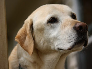
I'm FREE

I'm FREE

Wednesday, June 29, 2011

Lenny's Cousin "Blu"

   I'd like to introduce another member of Lenny's family, Blu. Apparently the blue American lobster numbers one out of two million lobsters.
I started very wet, with aureolin, quin. burnt orange and a bit of quin.  pink.
I had to mask the entire form before I did another wet "drop in the pigment" wash of burnt orange,  quin. violet and a touch of indanthrone blue.
Masking off. Wet-in-wet with quin. pink [very thin] and cobalt blue.
More w/w with cobalt blue and indanthrone blue.
I did a bit of lifting to suggest light source form right, painted the antennae, did some detail work, and I think I will call it "Done".  The framable size is 11 x 9 in. or 27 x 23 cm.

Saturday, June 25, 2011

... and Now for Something Completely Different ... Lenny

Loose blurps of aureolin and phthlalo blue


More blue, and some quin. siena


More of the earlier colors, plus some new gamboge
This is when I decided he needed a name.  


I think he looks so cute, in a lobster-ish sort of way!
11 x 9 in. / 28 x 23 cm.


   I really needed something very bright and different  to work on while I was finishing Carmella. I have NO idea why I decided on lobsters, but they are quite alien-looking [yes, I am a devoted science fiction fan] So I did a bit of research on the computer, found some good photos, and did a sketch. This particular lobster is an American yellow lobster - VERY rare, one in thirty million. 
   I have two more on the board to paint, and can hardly wait to let the paint fly! It feels great to get away form my usual controlled style of painting. I hope you like Lenny as much as I do. Let me know what you think!

Wednesday, June 22, 2011

Hmmm, I May Have Gotten Carried Away [or, don't paint when you're upset]

Washes of aureolin and quin. burnt orange/ I think I should have left it here
Washes of quin. burnt orange and alizarin crimson
Washes of quin. burnt orange and quin. violet
Wash of cobalt blue, to try to subdue some of the purple


   My emotions are showing; I'm upset about lack of work as a dental hygienist. As my sharpest critic [my aunt] always tells me "Don't paint when you're upset".
   Anyway, I'm committed to the darks. I may do another wash of cobalt blue, in the hopes of toning down the purples yet more. And I see that I must add some more depth and warmth to the dog. As always, comments and criticisms are welcome [including "fund-raising" ideas]
   Thank you for dropping by!!! 

Tuesday, June 21, 2011

Thank You All for the Push!


   I would like to sincerely than all of you who have commented on this painting. You inspired me, early this morning, to take a good look, get out brushes and paints, and start putting in a background to set off  Carmella. I am so excited with the results so far, I had to post it.
   I wet all the background and flowed in some aureolin, then while still wet, some quin. burnt orange. I'll be leaving the area around her nose lighter, and darkening from the outer edges inward. Thank you all again for your wonderful advice!!!

Monday, June 20, 2011

A Slightly Different Approach ... or ... Carmella the Second

Reference photo
My sketch
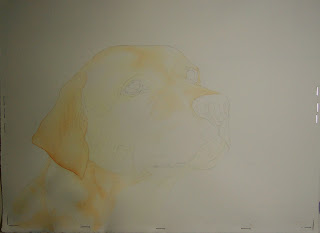
First washes of aureolin and quin. burnt orange
Looking mighty weird at this stage ... EEK!!!
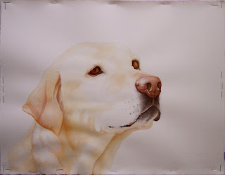
Many more glazes, and starting to look like a yellow lab
   First, a minor grump about the poor registration of the darks, especially browns and blacks, with camera and computer. That done, I'll continue.
   I've been reading a book by Elizabeth Kincaid called "Dance with Light". Her paintings, mostly florals and still-lifes,  capture quite a quality of luminousity. Her technique involves glazes of pure pigment ... no mixing. So I thought I'd give it a try. I must say it is a bit more involved, especially planning what color glaze on top of several others will give the color you need. And it was very strange, at one point, glazing the nose with GREEN! But the depth and colors you achieve make the process worthwhile. I must admit I "cheated" with my blacks, using my favorite combination of quin. burnt orange, quin. violet and indanthrone blue. And I will be doing the grey areas on the face with a mix of aureolin, quin. coral and indanthrone, but that will be it for mixes.
   The actual painting has more depth, of course, than the computer image, but I am wondering if Miss Carmella doesn't need a very soft and nebulous background to show her off better. What are your thoughts? And what do you think of the pure color glazing?
I am here


Friday, June 17, 2011

A Notice


   I'm just putting up a quick note to let you all know that I have put prices on most of my paintings. You are able to view them on the "pages" section of my blog. The framed paintings are not inexpensive, due to the cost of framing, but I am sure you will find the unframed paintings quite a bargain. The unmatted paintings, I will send on thick cardboard or foam-core. Also, I must add the cost of mailing to the aforementioned price. Let me know what you think of the idea. You may contact me via the blog or my gmail   -   studioatthefarm7@gmail.com

Monday, June 13, 2011

A Carp of Substance ... or ... I Think It's Done


Both photos are at the same stage, I just played with the iPhoto adjustments differently.


   Firstly, I would like to thank all of you who follow my blog, and who commented on the progression of this painting. I honestly don't believe I would have pushed myself to put a shadow down around the carp; nor would I have shaded its body to give it roundness and depth. It has made it a much better painting! Again, thank you all, and all criticisms are welcome.
   Now, onto another perspective of Carmella.

Tuesday, June 7, 2011

YAY ... Baby Pictures

The Kid


   Around 7PM, I went to get BrunZ from the back lawn, to put him in his paddock for dinner. There was a great kuffuffle of killdeer noises. When I looked in the direction of the nest, there was action. Mom and Dad were very busy trying to keep an eye on the two scurrying kids. [one egg not hatched yet] The kids were ALL over the place, with parents in hot pursuit. I ran back in to get my camera, and then managed to take some decent photos. Boy ... those babies run like the wind, and they are so well-camoflaged. Other than proportional differences, they actually look like miniatures of the parents.


Mom, in mid-photo

Mom at lower right, and baby up against fence post

Another baby picture

SO well- colored, almost invisible 

Baby at lower left, and Mom or Dad at right

The remaining egg

A most protective parent


Sunday, June 5, 2011

The Carpster


   It took a bit of "intestinal fortitude" to get to the point where I could lift some of what I'd done to create the illusion of ripples on the water surface. I marked it off with a dinner plate on the outside, then measured off the inside circles. I did it in an irregular manner, to get more of a look of reality. I also darkened the orange of the face, and some of the scales.
   I think what is left to do is to give the body more depth with some form shadow, and darken the pectoral and tail fins. What do you think needs doing?

Thursday, June 2, 2011

The Carpoholic ...

 ... as of now

 I have it ... a plan for the water. I've done another sort of pour, with cobalt blue on the right and around the fish, and indanthrone blue on the left and around the entire perimeter. The carp needs more darkening/detail work. I may do some more indanthrone on left, and then I will create ripples from the lower right.