I'm FREE

I'm FREE

Monday, August 6, 2012

She Is One TOUGH Woman ... or ... A Portrait of My Riding Instructor

My trainer, Rhonda - sweet, kind to the animals, an excellent instructor, and tough when the situation calls for it. I've always admired her coloring. She looks so "peaches-and-cream" healthy all the time.
My sketch

1st very thin glaze of quin. burnt orange

A grey glaze for the shadows

Flesh color over face and neck
Looking very weird at this stage

Some local color, and 1st glaze for the eyes

More local color, and starting the lips

Rhonda has been invaluable to my horsey life. She found Bruno for me. She referred me to Andy, the great hay supplier. She has been a help with training and health issues with the horses. And she is just an all-round good, up-beat person.
I first met her about 8 years ago, working in a dental office in Langley; she was a patient. Then, a few years after that, I was having problems with a young thoroughbred I had, and she came to help in his training. The horse did not straighten out, and I gave him back to the rescue group from which I had acquired him, but I stayed with Rhonda as a trainer. Yes, I basically ride dressage, and she is a hunter/jumper rider, but her knowledge is great, and her attitude is fabulous. As long as I have been painting with portraits, I have wanted to paint her. Her coloring is enviable - all year round. So here is the start of my 1st attempt ...

As always, your comments are most welcome!


Wednesday, August 1, 2012

Another Portrait from Beginning to End

Sketch

Grays for shadows

Start flesh tones and eyes.
It really is looking quite scary at this point!

Hair roughed in. More color in the face.

Yet more hair and face colors.

Two glazes of a black in shadow areas of cap. I wanted to use ultramarine, and it doesn't go as dark as I needed here.


I painted light and scrumbled colors for the gown, and  an irregular wash/application of ultramarine for the background. I may have to glaze a bit of pink over part of her face, as the blue seems to have drained some of the color from her face, but I'll wait till tomorrow, when I can see it in daylight.

As always, your comments are most welcome.

Andy ... Beginning to End!!!

Sketch

Grays for facial structure

Flesh tones

Some facial features

Shirt, hair, adding depth to face

More color on face

The grizzled, rougher look

Background


Had a busy and productive day. Riding lesson - a tough one for Bruno and me - at 9 AM. Then I moved 20 bales of hay, to make room for another year's supply. Did a bit of painting. Had a wonderful nap. Back to painting.
My riding instructor is the person who introduced me to Andy, when I was looking for a new hay source. I showed her the painting after our lesson, and she said, yes, it did look like him, but needed to be rougher looking. So I spent my painting time today roughing up Andy, and I think it worked quite well.

As always, your comments are most welcome.


Monday, July 30, 2012

Thank You, Prabal ...

I thought I had finished at this point ...

then I went over the foreground cobalt blue with a w/w glaze of ultramarine

added a bit of ultramarine to the bee' shadow

Then I received an email from Prabal Mallick, at http://michael-learns-to-paint.blogspot.ca   He asked a "what if" question - my favorite type of question! What if you darken the background behind the bee? So I did - a graduated and a flat wash of quin. burnt orange below, and another of cobalt blue above. I really think it makes the painting a much better composition. Thank you, Prabal!

As always, your comments are most welcome.

Saturday, July 28, 2012

Another One I HAD to Get Out of My System

I started with the warm reflected light around the base of the window ...

I very lightly painted the shadows w/w ...

Worked on the wings and legs ...

Some yellow {aureolin + quin. gold} on the body ...

Started some of the detail - mind you, with something this small {about 5.5 x 7.5 inches}, it's almost all detail.

This is as far as I got today. It may need a bit more oomph!

This was the reference photo. The soft contrast of the cool and warm shadows, and the reflected light and images are what attracted me.

As always, your comments are ever welcome.

Paying It Forward ...


   A few days ago, Linda Roth awarded me the Liebster award. Apparently, it is awarded on the basis of what is considered a good and worthy blog that has less than 200 followers. I have a blog list of about 200 that I follow, so it is not an easy decision to come up with only 5; I would nominate almost all of them. However, I have decided to consider consistency of posts, and sharing ideas and giving help with art problems.

http://www.sandysandysweblog.blogspot.ca
http://www.crystalcookart.blogspot.com
http://www.susansmolenskyfineart.blogspot.ca
http://www.irinasztukowski.blogspot.ca
http://www.tweedles-georgie.blogspot.ca

These lucky bloggers have the choice of passing on the Liebster to 5 more worthy blogs, or just passing.

Additionally, I must divulge 5 things you don't know about me. OK, this is an EEK for me, as I'm somewhat of a private person, but ...

   I do not own a TV. I got rid of it a year ago, and don't really miss it at all, and I definitely don't miss    
    the advertising.
 
  I think I could live without creating art as I do now. I could not live without a horse!

  I LOVE Italy - the food, the people, the language, the art, the architecture, the landscapes ...

  I have never been in a Wal-Mart.

  I collect frogs - wooden, stone, clay, papier mache, glass ... anything.

OK, Linda, I paid it forward!


Tuesday, July 24, 2012

"Live and Learn" Tuesday .. or ... Another Case of Win Some, Lose Some

Portrait looked like it was starting out well ...

When I started applying the flesh tones, the orange in the shadows was apparently too much.

I tried lifting it with a sponge, but it left the paper surface too grainy and roughened. I played with the hair , but that didn't inspire me too much, so this will be re-cycled as a color-testing swatch.

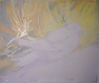
The bird seems to be all right. I wanted to play with a technique I read about a few years ago, gradually masking small areas and then painting.


Initially, I used aureolin, quin. burnt orange and cobalt blue. It wasn't quite intense enough, so I did some sectional washes with mixes of aureolin, quin. burnt orange and phthalo green[YS].   

It came out all right, but may need some tweaking.


As always, I welcome your comments!